
Best Wine Labels in Croatia
 In this article, we focus on the best wine labels. A label is just one essential element of the general appearance. Yet, it is fundamental and also obligatory.
When we say Best Wine Labels, we mean best-designed wine labels. Sure it is arbitrary and depends on individual preferences, but graphic designers have their own award competitions. Similar to what the wine world does.
Some wines stand out because of the content of the bottle. Others stand out because of their appearance. The best-case scenario is when a wine stands out for both, especially when the appearance is deeply connected to the content of the bottle.
Understanding Croatian Wine labels
In Croatia, wine labels are easy to understand if you know the requirements for labeling:
- Designation of origin (ZOI) – sometimes named as “vinogorje”: Istočna kontinentalna Hrvatska 2. Hrvatsko Podunavlje 3. Slavonija 4. Zapadna kontinentalna Hrvatska 5. Moslavina 6. Prigorje-Bilogora 7. Plešivica 8. Pokuplje 9. Zagorje-Međimurje 10. Primorska Hrvatska 11. Hrvatska Istra 12. Hrvatsko primorje 13. Sjeverna Dalmacija 14. Dalmatinska zagora 15. Srednja i Južna Dalmacija 16. Dingač 17. Ponikve
- Winery name: registered official name of the producer
- Variety: if at least 85% of the wine is made from that variety
- Name of the wine: This could be a fantasy name or any combination of symbols to distinguish a certain wine. Such could be a blend of varieties, but it could also be a varietal wine
- Vintage: if at least 85% of the wine is from a single vintage
- Alcohol content: in percentages
- Net quantity: usually in litres, 0.75 L, 1.5 L or other
- Traditional marks: for example, Croatian wines used to be labelled as “stolno” (translates as “table quality” wine), “kvalitetno” (translates as “quality” wine), or “vrhunsko” (translates as “premium quality” wine), but these marks shouldn’t be considered as quality indicators anymore.
- Other requirements: LOT numbers, administrative markings

Because all of these requirements take up a lot of space, most wineries use two labels. One label to show the necessary information. Another label to express the particular wine’s individuality and the winery’s visual identity.
Also, as of December 8th 2023, every new vintage must declare ingredients, including allergens and nutrition information. These are the latest EU regulations for wine labelling.
Because of the limited space available on printed labels, wineries are allowed to use QR codes. QR codes printed on wine labels will enable everyone with a smartphone to access the required information about wine on special e-label web pages.
Best Wine labels
The design of a wine label is an art form in itself. It is often a challenge to achieve effective design principles and aesthetics.
Visually stunning labels trying to catch the attention, have aesthetic appeal, and tell the story of the wine or the winery are difficult to design.
What makes a wine label design truly exceptional is the seamless fusion of creativity and functionality.
Elements of a Compelling Wine Label
A compelling wine label balances intricate key visual elements:
- Visually Captivating Graphics: illustrations, photographs, or abstract designs
- Distinctive Typography: fonts and typography contribute to the overall aesthetic and readability, but also to the general appearance
- Color Schemes: a palette of colors that aligns with the wine’s characteristics
- Storytelling Elements: through subtle imagery, a brief narrative, or symbolic elements, communicate the heritage, origin, and unique qualities of the wine
- Symmetry and Balance: composition contributes to the label’s coherence
- Texture and Finishes: Exceptional labels often incorporate textures or finishes such as embossing, foil stamping, or speciality paper to add depth and a luxurious feel
- Consistency through Visual Identity: A compelling wine label design aligns with the overall brand image and ensures consistency across product lines.
- Sustainability and Eco-Friendly Design: Using recycled materials, eco-friendly inks, or indicating the winery’s commitment to sustainable practices
- Innovative Label Shapes and Formats: Unusual label shapes or unique die-cut designs can make a bottle stand out
Ultimately, what makes a wine label design truly exceptional is its ability to evoke emotions, stimulate curiosity, and enhance the overall experience of enjoying a fine bottle of Croatian wine.
Best Croatian Wine Labels
Examples of some of the best-designed and most awarded Croatian wine labels follow.
Recognitions and Awards
The most awarded Croatian wine labels in modern times are:
- Piquentum St.Vital collection
- Korlat line
- Stina winery
- Saints Hills winery
- Šuran winery
Highlighting Top Croatian Wine Labels
In this section, we spotlight some of the best Croatian wine labels.
From the distinguished Piquentum to the innovative Saints Hills and the sleek Stina, each label has a unique story to tell.
Piquentum Wine Labels
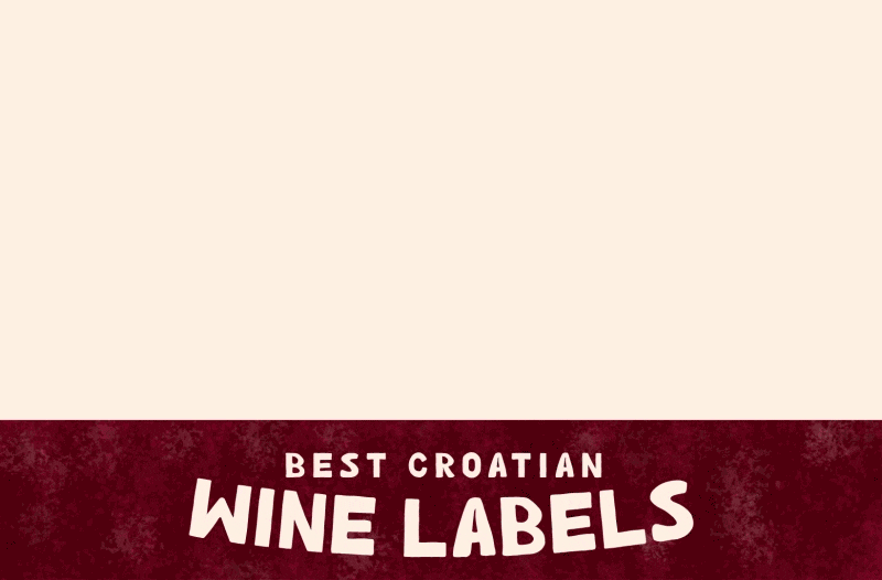
 The basic idea about the design of Piquentum packaging lies in raising awareness about the year of harvest denoted on the bottle. Piquentum Winery is devoted to respecting the cycles of nature in winemaking.
As a result, every vintage of Piquentum wine depends greatly on the weather conditions shown on the label.
Data on weather conditions in vineyard territory was collected in cooperation with the Meteorological Institute. The amount of precipitation was used as a variable that can best show nature’s diversity graphically each year.
The indicated data start with October of the previous year and end with the month of harvest – September of the current year.
The label has won over ten national and international awards and has achieved significant media coverage.
Korlat line labeling
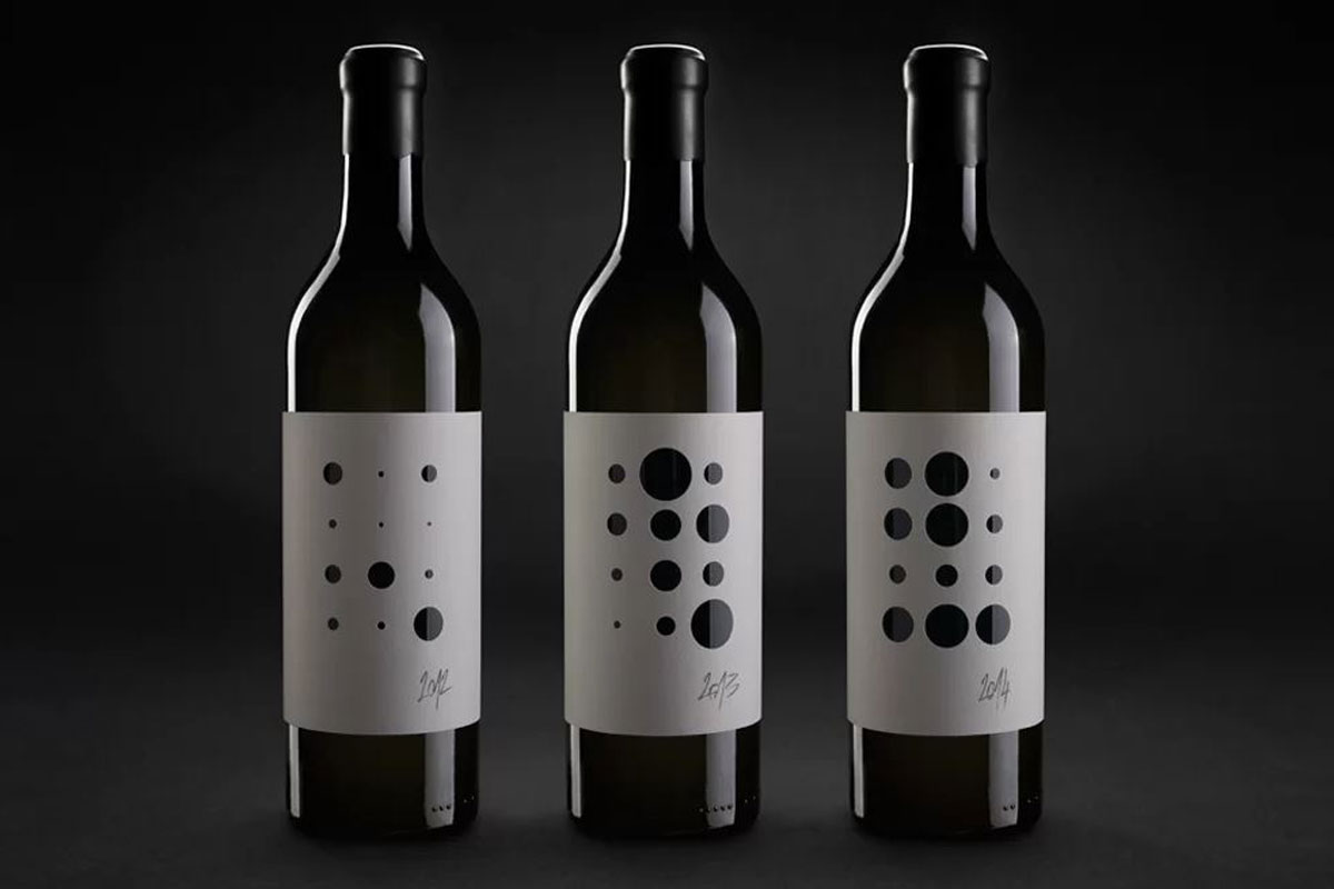
 Korlat is one of the Croatian wines that has won the world-famous Red Dot Award for design.
With emphasised modern elements, the uniqueness of this label was in the fact that it was printed directly on the bottle using special printing techniques, which, with its shape, ideally rounded off the strength and character of these wines.
The most significant element emphasised in the bottle is the vintage. Curiously, each vintage symbol is designed differently for each consecutive year. Yet, the label and the wine are unmistakably recognisable year after year.
Simultaneously, each wine type is distinctive by colour. Red is for Syrah, blue is for Merlot, and purple is for Cabernet Sauvignon.
This may not be the first printed-on-the-bottle label, but the way it achieves visibility, recognition and distinctiveness is still unique.
Stina Winery Labels
 A label that has won countless awards. The colour and the texture of the label paper resembles the famous Brač stone.
Stina wine is also produced on the island of Brač, known for its white stone that has inspired many artists for centuries. That’s why labels are a blank white canvas that invites everyone to express themselves creatively.
The First Single-vineyard wine of the winery is named Stipančić, after the vineyard. Stipančić is a hard-to-access stony vineyard which is cultivated on an extreme slope. Its four-layer label evokes precisely this inclination. Thus, everyone who expresses creatively has one challenge: to create according to the label’s slopes, just like the winemakers in the Stina Plavac mali Stipančić vineyard.
Saints Hills Winery Visual Identity
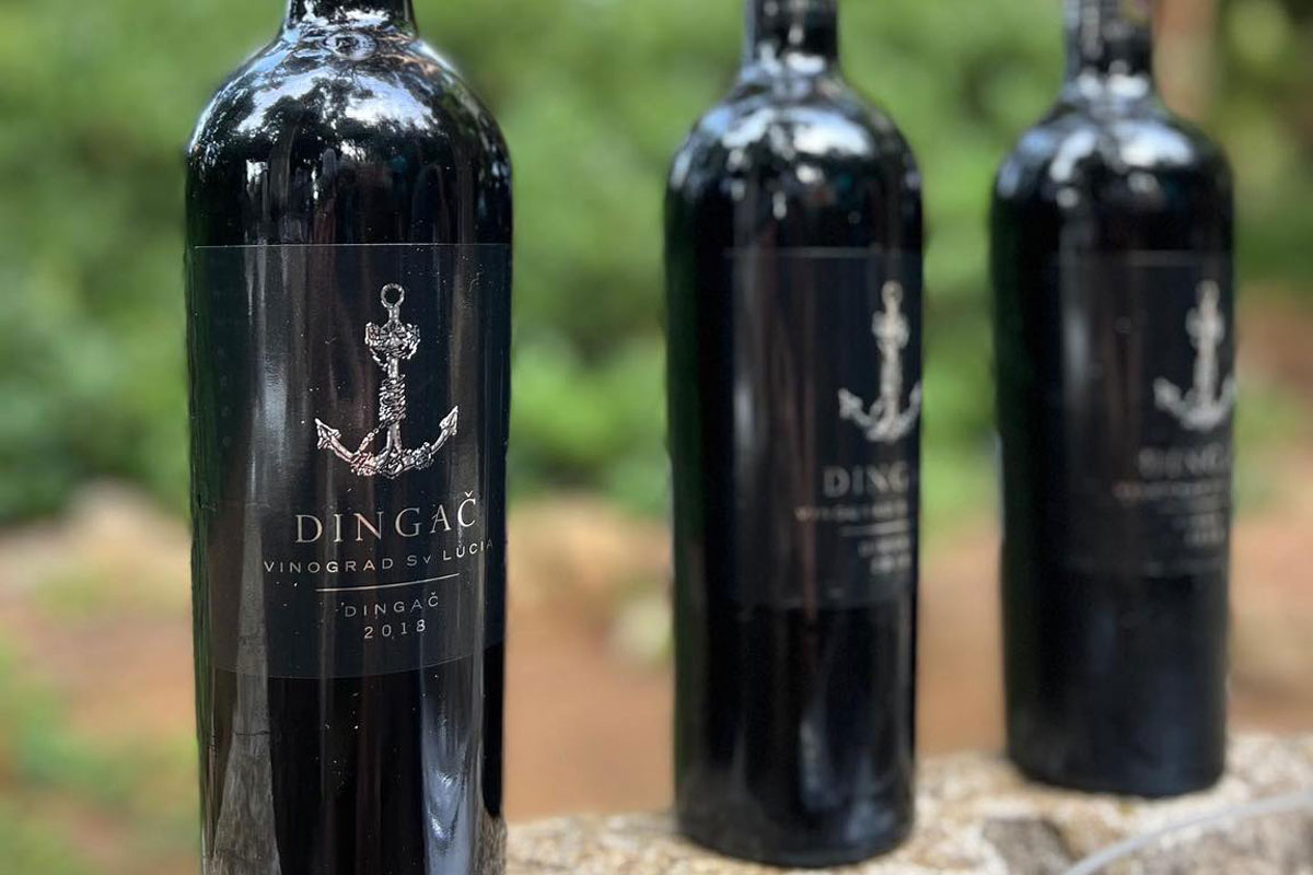 Designed in London, Saints Hills labels are an original design that directly connects the product and the region it comes from.
It does not print on the bottle directly, but it uses transparency and overall bottle appearance to make a new whole. With centred image and symmetrical composition, only in a more modern appearance, these labels are distinct from each other yet clearly belong to the same identity.
In a designer’s own words, “On a global scale, Dingač is the original wine of the autochthonous Dalmatian variety, Plavac Mali. Therefore, after analysing international markets, we created a design that follows that trend wherever Saints Hills wines are served worldwide”.
Šuran Winery label
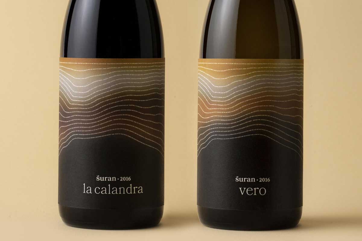 The basis of the innovative idea of the Packaging of Šuran biodynamic wines is hidden behind the most important characteristic of its production.
Namely, the grapes were treated only with traditional organic substances, which increases the microbiological activity of the soil. This activity is presented through the soil layers, while microorganisms are shown in maximally reduced letters that form a quote from the Italian scientist and activist Carlo Petrini.
The text that calls for environmental awareness is invisible to the naked eye, so a magnifying glass is integrated into the lid so the user can read it.
In 2022, this label has won the Dieline Award and Art Directors Club New Your Merit Honor.
Enosophia Interactive AR label
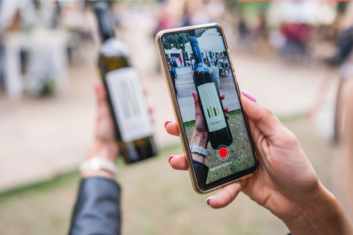 When we mention interactivity as a feature of label design, we should also mention the first Croatian wine with an interactive AR label.
In 2021, Enosophia launched Graševina TRS No. 5 and rose Matarouge. Augmented Reality technology provides app users with stimulating information about wine.
Vislander Visual Identity
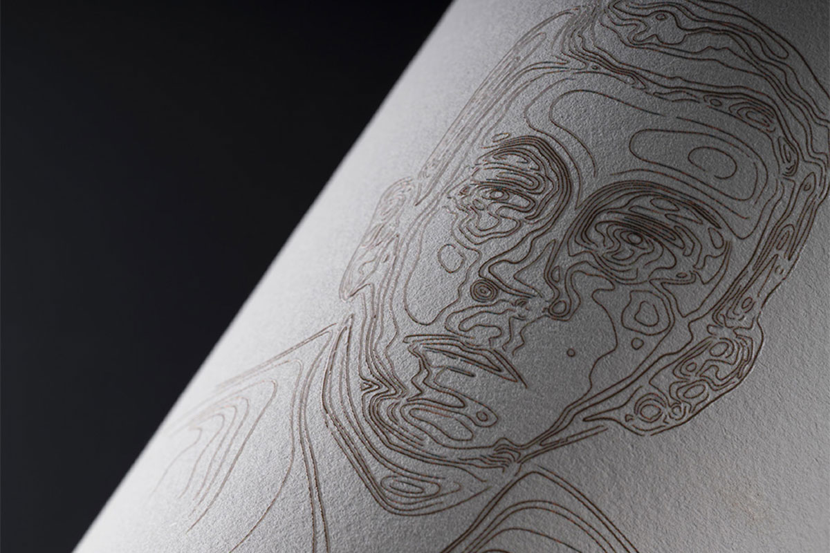 During World War II, the people of Vis, Croatia, struck a unique deal with British soldiers stationed on the island. Facing food shortages, the islanders traded their Plavac wine for the soldiers’ Meals Ready-to-Eat (MREs). The perfect sandfield terrain and sustained labour made this pact a complete success.
This is how the island’s intricate history, intertwined with a family’s journey, gave rise to – Vislander.
The label design showcases the island’s topography and vintage family photos, paying homage to the winemaking legacy this vineyard embraces. Reflecting the distinctiveness of each vineyard and its location, Vislander captures a unique winemaking route.
Adhering to a rich winemaking family tradition, the Franka D.M. Vis Winery remains committed to sustainable practices. They refrain from synthetic pesticides and chemical fertilisers, prioritising the well-being of soil, grapevines, and fauna. With grapes hand-harvested and processed to the highest standards, Vislander products honour the island’s history and terroir with equal reverence, setting them apart.
The Vislander winery makes wines from Plavac mali and Vugava grape varieties indigenous to the Island of Vis.
The product range includes premium wines, as well as grappas and gin.
Although putting faces on wine labels is nothing new, Vislander did it uniquely. Every face is a topography map simultaneously. Topography is something very important for winemaking and living on the island of Vis to this day.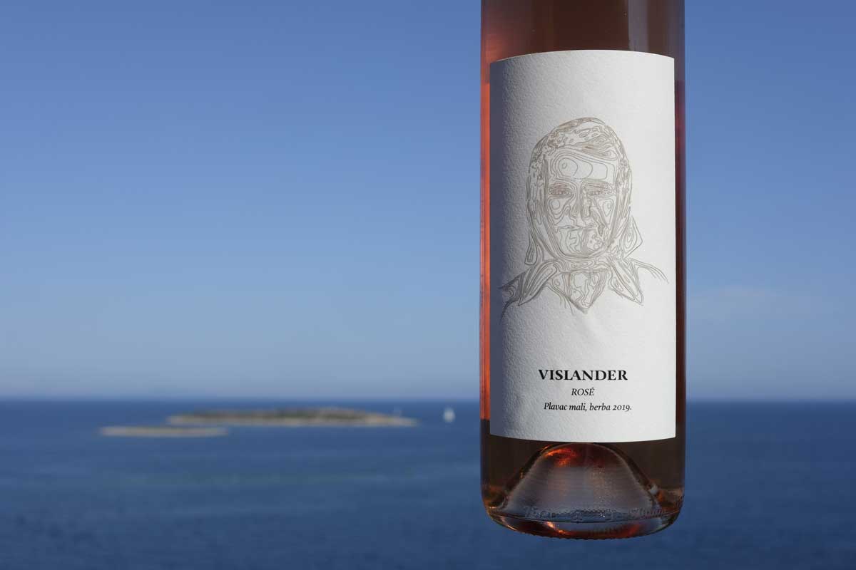
Conclusion
A captivating wine label design combines various elements to give consumers an engaging and visually pleasing experience. From eye-catching graphics to storytelling and eco-friendly features, each aspect is essential in transforming the wine label from a mere tag to a beautiful artwork that elevates the overall enjoyment of the wine.
Labels are one of the most important elements of the overall visual appearance of a wine bottle. Wine labels are responsible for providing a memorable visual experience of what we will be experiencing with other senses.
A particularly interesting trend is a kind of ‘narrative’ label, asking the customer for some form of engagement, reading, discovering the story behind a particular wine, looking for the hidden and unknown in the seemingly familiar, an invitation to travel through time and distant places.
In the Croatian traditional wine market, one “rule” used to be valid: The worse the label looked, the better the wine was 🙂 Today, however, many wines are getting accolades. And many labels too.
Regardless of the wine label design, the bottle’s content will always make a difference. The idea of some poor-quality wine selling well if it is packaged in an expensive-looking bottle is becoming a thing of the past.
Even if consumers could be fooled more than once, these tactics will certainly backfire. In the long run, authenticity prevails over deception.
In the dance of design and content, being real is the winner. It ensures people like how it looks and enjoy the real goodness in every bottle.