Wine Label Designs that leave you salivating
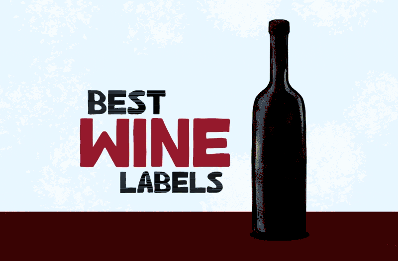 Wine label design is a powerful tool. There are probably millions of different wine labels in the world. Among all those trying to stand out, we have chosen the most attractive examples. Each of them inspires designers who shape wine labels. However, the most successful labels stimulate consumers to try the product.
Modest or dramatic, mystical or ready for its close-up on Instagram, wine labels these days are like a box of chocolates—diverse, essential, and ready to steal the spotlight.
What do the wine labels mean?
The purpose of the wine label is to make a particular wine recognisable. As a result, wine labels create associations between a particular wine and consumer experience.
Legal obligations for wine labels prescribe the necessary content of the label. These obligations differ from one country to another. A legal purpose of the label is usually to identify the bottle’s content: varieties, producer, appellations, if applicable…
Yet, wine labels can be much more than just identifiers; they are storytellers. When the label encapsulates the essence of the wine within, it tells a tale of the wine. The story of the region’s heritage, the winemaker’s passion, or the unique characteristics of the grapes.
What should be included on a wine label?
Every wine label should convey essential information to the consumer. The necessary details include:
- the grape variety or a particular appellation,
- region of origin,
- alcohol content,
- and winemaker’s information.
Understanding what should be included on a wine label empowers consumers to make informed choices.
That is the purpose behind the latest EU regulations for wine labelling. From December 8th 2023, every new vintage will declare ingredients, including allergens and nutrition information.
Because of the limited space available on printed labels, almost every winery will use QR codes. QR codes printed on wine labels will enable everyone with a smartphone to access the required information about wine on special e-label web pages.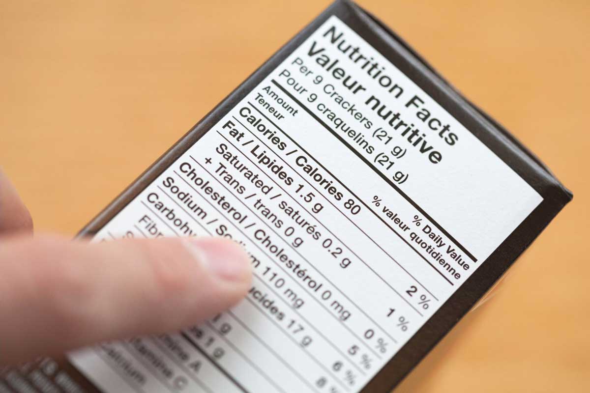
It might come as a surprise, but vintage and some other seemingly essential information, such as residual sugars, are not necessary.
Wines could be multi-vintage, as is often the case with Champagne. Also, many wines classified as dry might have higher residual sugars but also higher acidity, which makes them dry, as defined by many Austrian or German Riesling wines, for example.
Best Wine label design
Crafting a wine label is an art, a tricky masterpiece. Striking the right balance between design principles and aesthetics is like walking a tightrope.
Creating visually dazzling labels that grab attention, exude charm, and narrate the tale of the wine or the winery is no easy feat.
But what transforms a wine label into a true showstopper is the magical marriage of creativity and functionality, seamlessly blended for an extraordinary design. It’s the secret sauce that makes a label not just eye-catching but also brilliantly functional.
Elements of a Compelling Wine Label
A compelling wine label balances intricate key visual elements:
- colour schemes,
- typography,
- imagery,
to create a harmonious and memorable composition.
Captivating Graphics
The first element that grabs a consumer’s attention is visually striking graphics. These can include illustrations, photographs, or abstract designs that complement the brand identity and convey the character of the wine. The graphics should resonate with the target audience and evoke emotions associated with the wine’s story.
Distinctive Typography
The choice of fonts and typography contributes to the overall aesthetic and readability of the label. A compelling wine label design uses typography to convey a sense of elegance, playfulness, or modernity, depending on the brand’s identity and the wine’s intended positioning in the market.
Typography could also be used as an illustration or part of abstract design.
Thoughtful Color Schemes
Storytelling Elements
 A truly exceptional wine label tells a story. Whether through subtle imagery, a brief narrative, or symbolic elements, the label should communicate the heritage, origin, and unique qualities of the wine. Consumers are drawn to labels that glimpse the winery’s history or the winemaker’s passion.
Balance and Symmetry
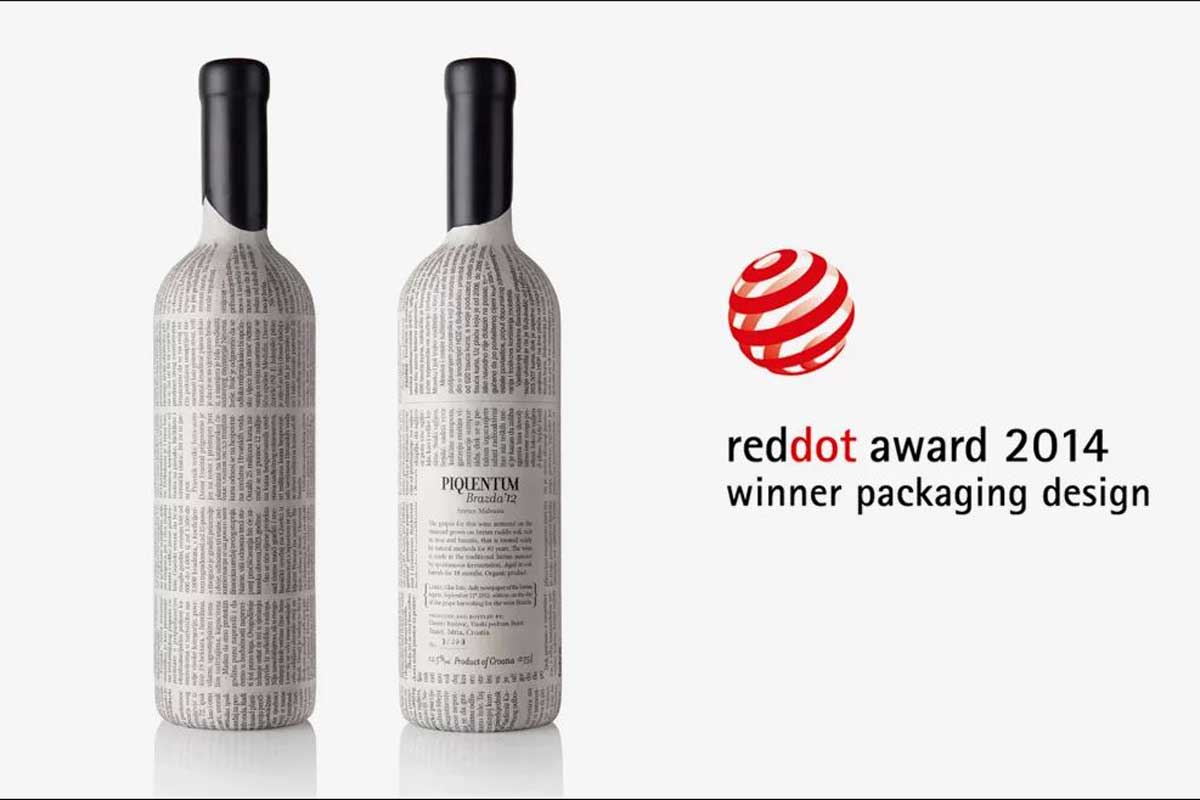
Texture and Finishes
The tactile experience of a wine label can enhance its appeal. Exceptional labels often incorporate textures or finishes such as embossing, foil stamping, or speciality paper to add depth and a luxurious feel. These tactile elements contribute to a memorable and premium perception of the wine.
An ideal example is the texture of paper reminding of a white stone for which the island of Brač is famous, in the Stina winery label.
Consistent Branding
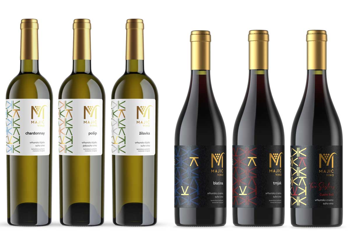
A compelling wine label design aligns with the overall brand image and ensures consistency across product lines. This includes using similar colour palettes, fonts, and graphic elements, creating a cohesive and recognisable brand identity that resonates with consumers.
Sustainability and Eco-Friendly Design
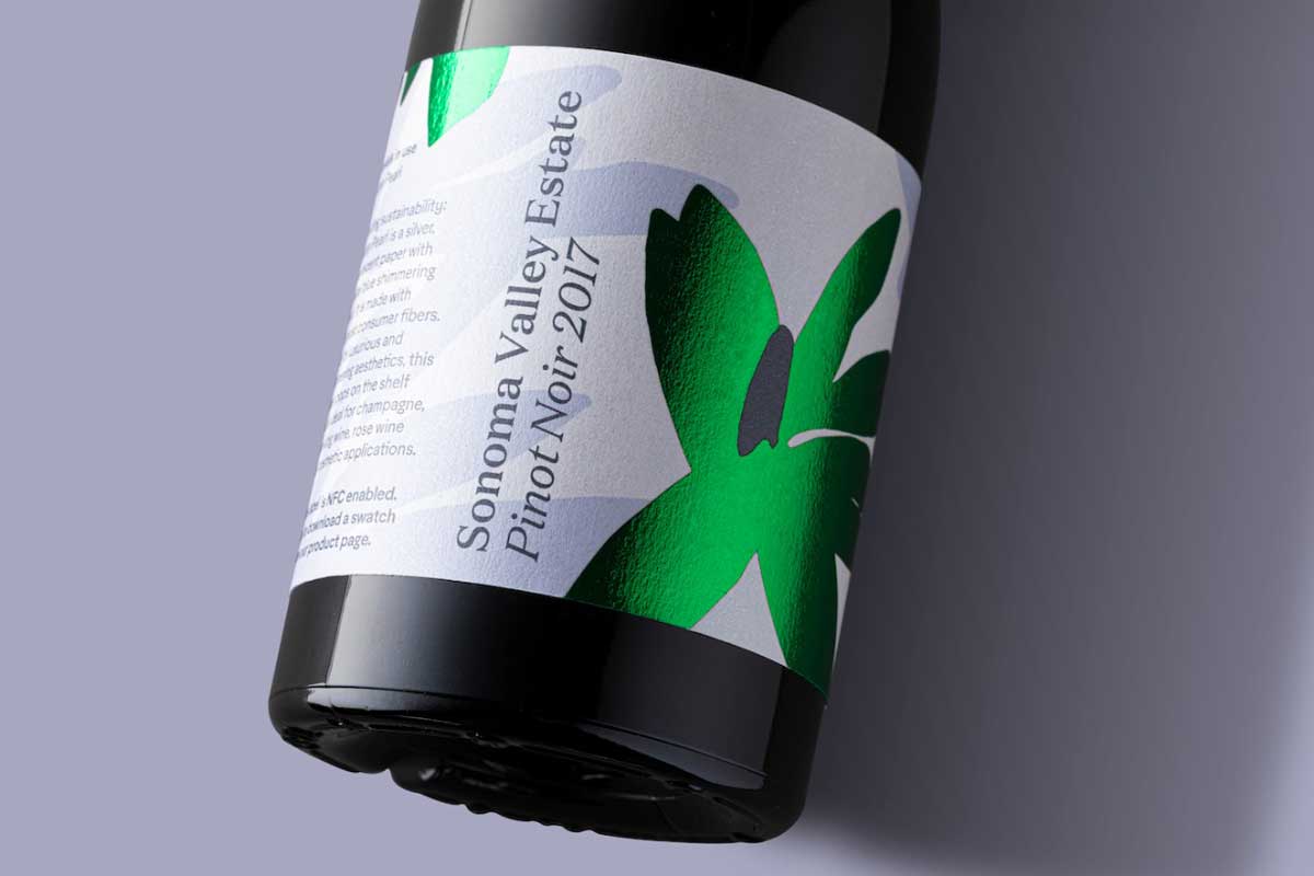
In the contemporary wine industry, environmentally conscious consumers appreciate labels that reflect sustainability. Using recycled materials, eco-friendly inks, or indicating the winery’s commitment to sustainable practices contributes to a compelling and responsible image.
Innovative Label Shapes and Formats
Breaking away from conventional rectangular labels, some compelling wine labels explore innovative shapes and formats. Unusual label shapes or unique die-cut designs can make a bottle stand out on the shelf, inviting consumers to look closer.
However, each label design incorporates other essential factors, such as:
- Bottle shape: different bottle shapes (Bordeaux shape, Burgundy shape, Riesling shape…) directly influence the label dimension and overall appearance
- Cap: Colour and the material used (foil, silicone, metal…) can distinguish a successful design from a lesser one
- Cork: Even cork could be visible and coloured to enhance the appearance of the wine
To sum it up, a truly successful wine label design goes beyond mere ornamentation; it becomes a vessel for storytelling. It encapsulates the wine’s essence, the grapes’ unique character, and the winery’s heritage in a way that resonates with consumers.
Wine Labeling Ideas
In the vast world of wine label design, creativity knows no bounds. Winemakers and graphic designers continually push the boundaries, experimenting with diverse styles and concepts to create labels that not only distinguish their products but also tell a compelling story.
In this section, get inspired by various concepts and styles, from classic and heraldic designs to modern and conceptual approaches. Discover how typography, minimalism, and unconventional elements play pivotal roles in shaping the visual identity of wines.
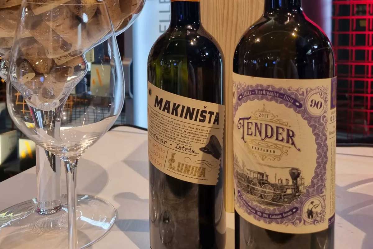
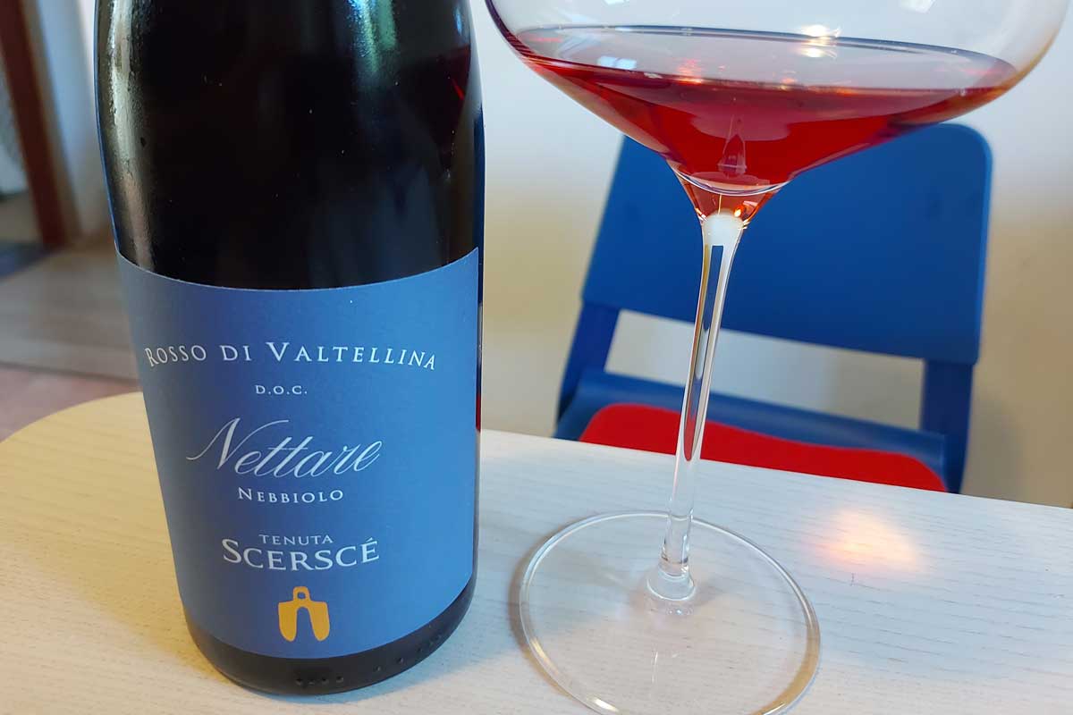
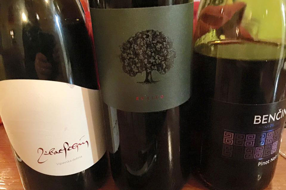
Classic Wine Labels
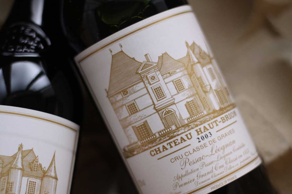
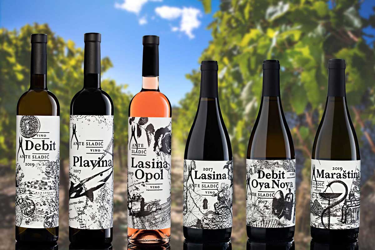
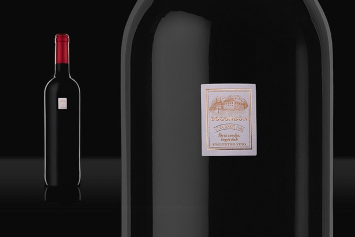
The advantage of many wines is their tradition. Therefore, many winemakers want to emphasize their tradition. Their labels are deliberately designed after the template of vintage French, Italian or Spanish labels.
Sometimes even newly opened wineries want to use archaic motifs and compositions to give the impression of tradition, even though they don’t have it. This does not have to be misleading but can suggest the desired style and philosophy of winemaking.
The best example is the numerous labels of centralized composition, usually with an illustration of “Chateau” in the middle and serif typography.
Wine Labels with family crests
Heraldry and the inheritance of family coats of arms from feudalism is a common way wineries want to show their deep family heritage. From the consumer’s point of view, it is promising if the winery puts its family signature on the wine label. We expect them to guarantee quality with their “name and surname”, that is, personally.
Such labels are also widespread and are a subtype of classic wine labels.
Typographic Wine Labels
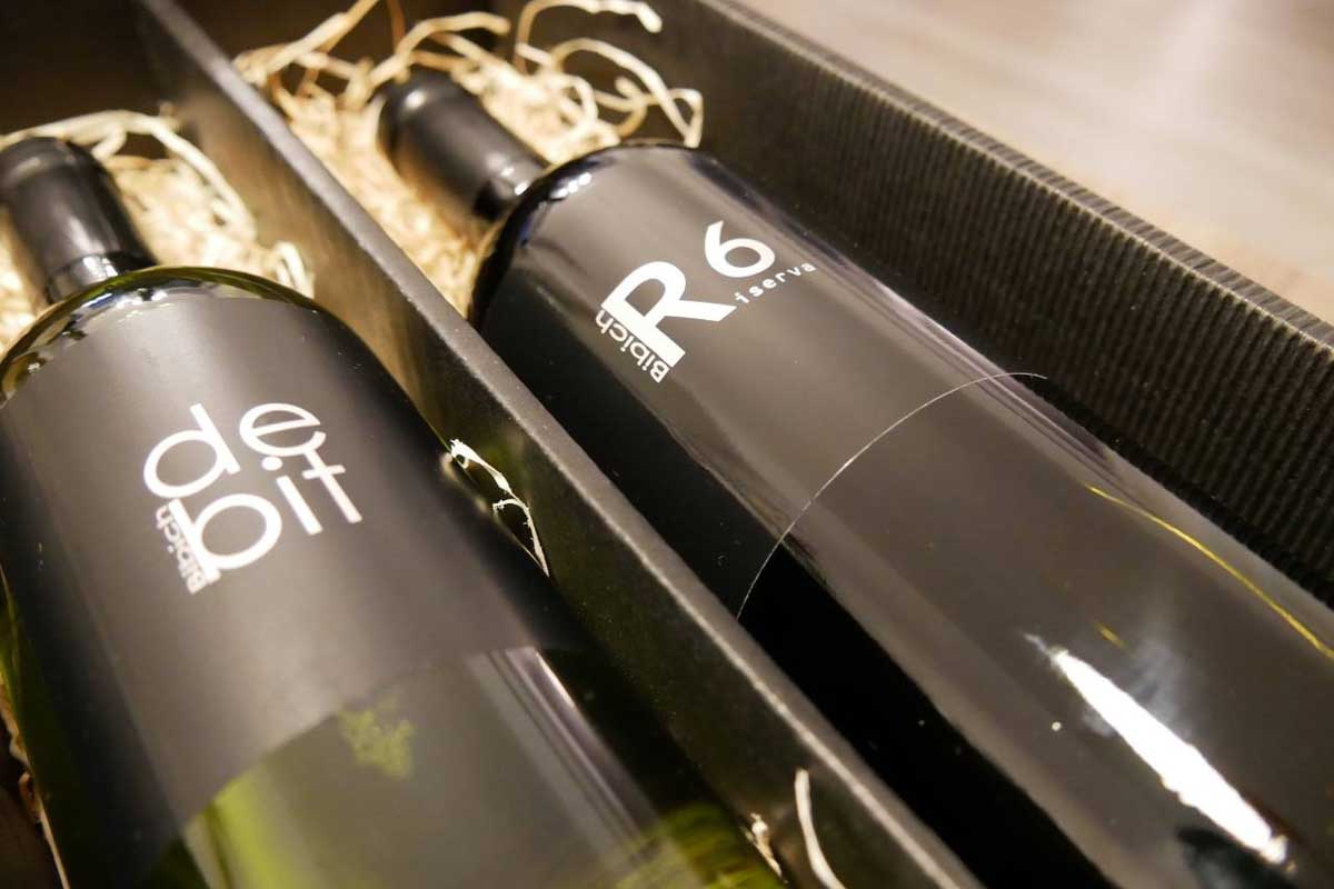
Minimalist Wine Labels
The principle of these labels is to divert attention from the lack of elements. The logic is justified, in a forest of different colored labels, it is easier to stand out with “nothing” than with anything
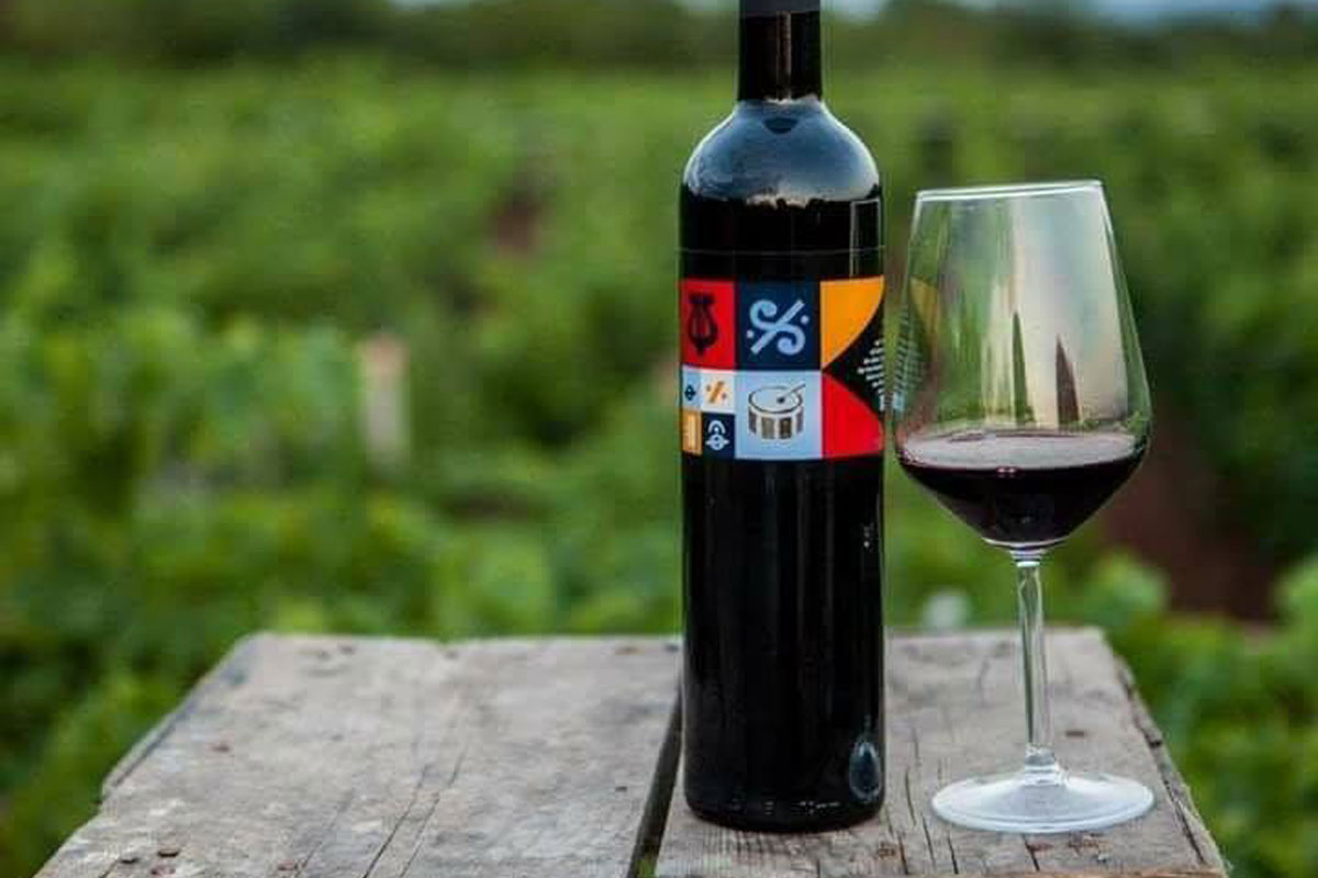
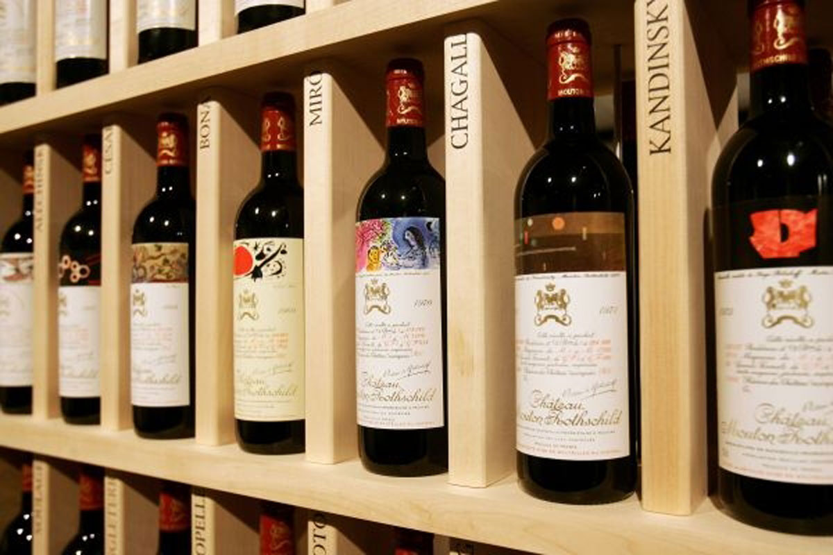
Unconventional Wine Labels
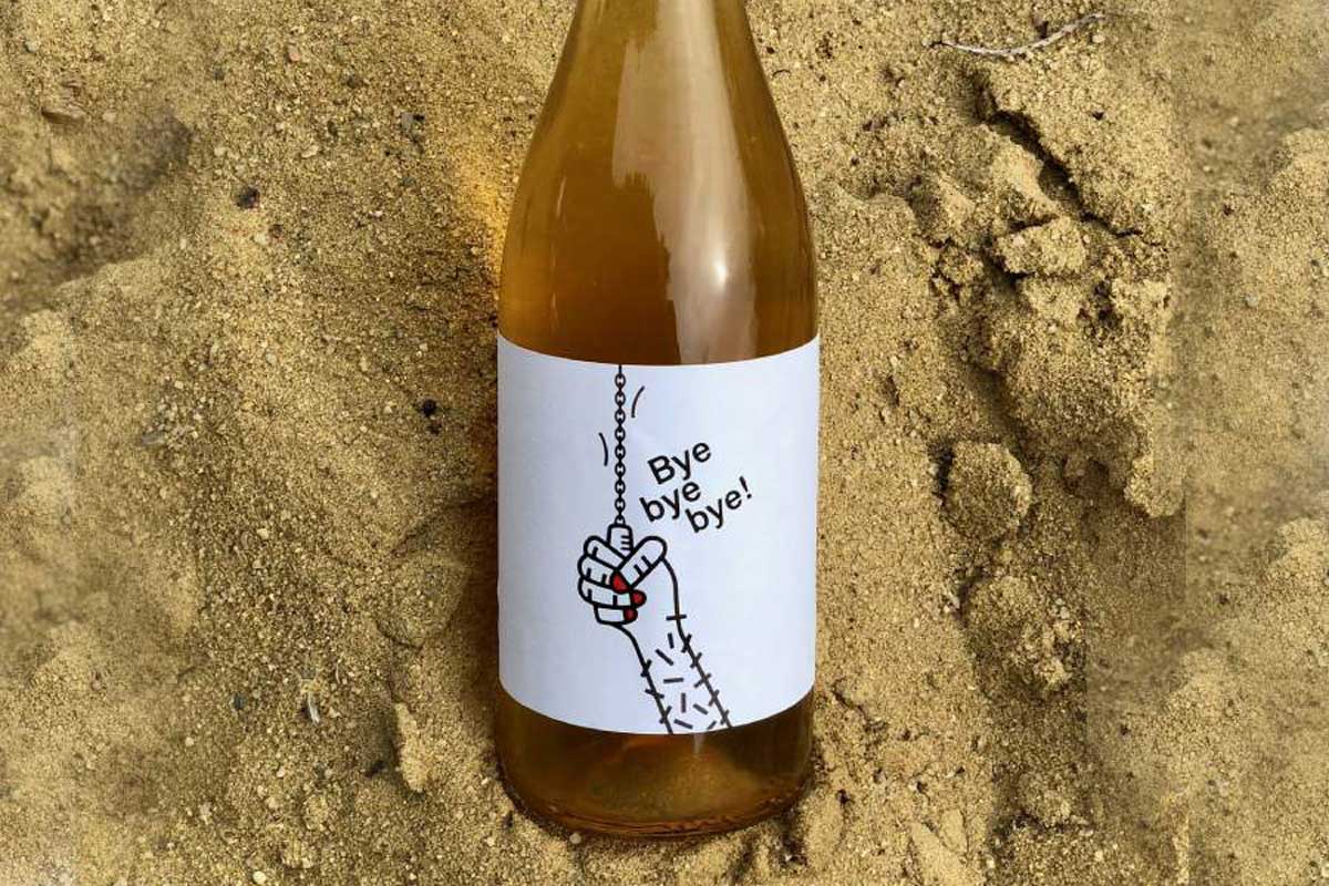
A growing number of labels with unusual elements belong to this group. Most often it is an illustration, a photograph or a similar graphic effect that deliberately deviates from our expectations.
The goal is to be different at any cost, even if it causes controversy. These labels often appeal to an audience that does not want snobbery or similar attributions associated with orthodox labels of traditionally prestigious wines.
All labels whose elements are unusual compared to the conventional and all labels that use elements in a new or unusual way are in this category. We do not expect symmetry here. Very often so-called “natural” wines are labeled this way. In a large number of cases, the design of the label credibly describes the content.
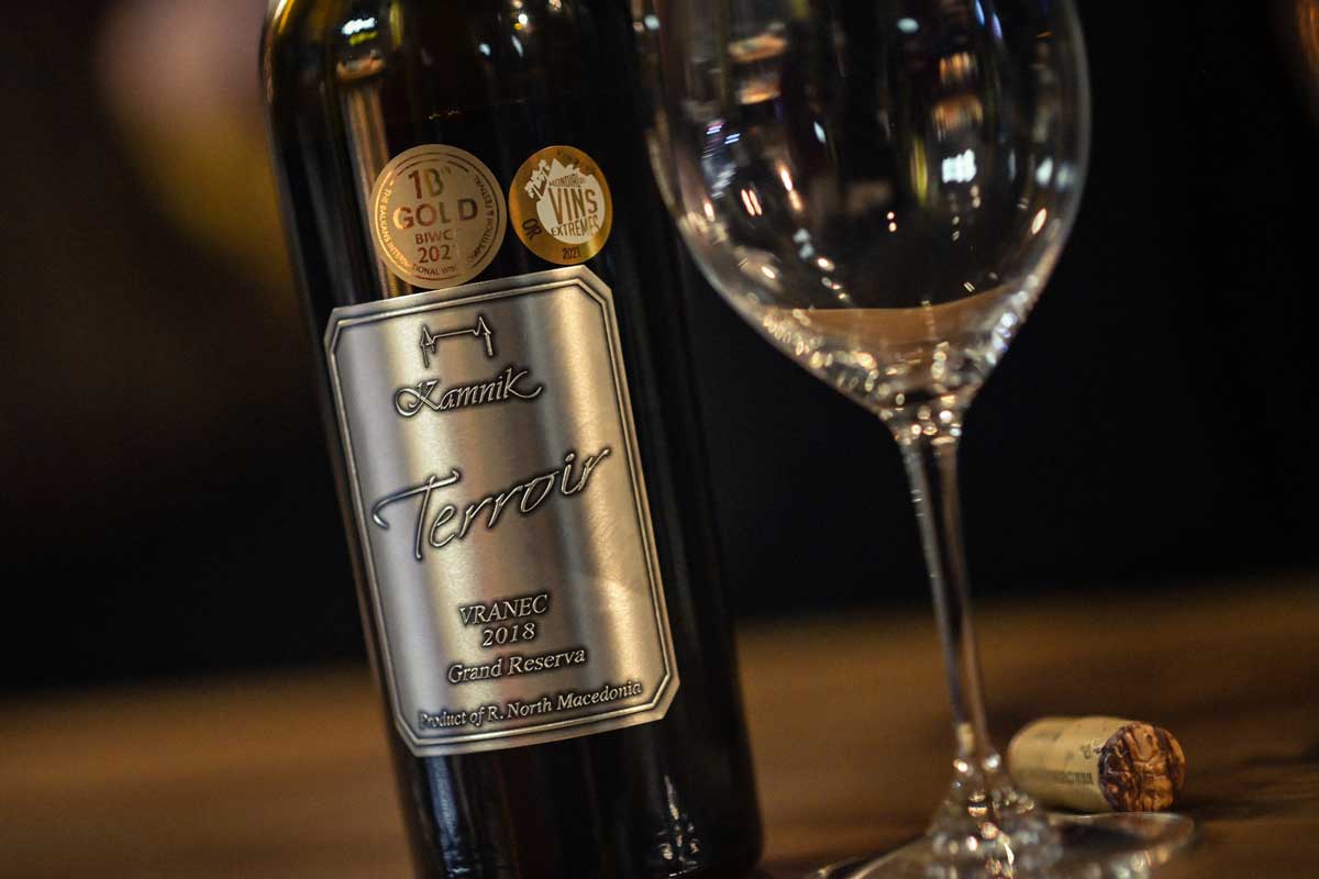
Modern Wine Labels
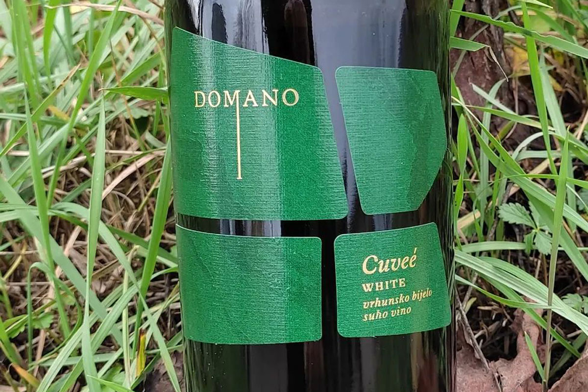
Hence, all possible motifs are used, animals, plants, flowers, abstract motifs, as well as photos, graphics, drawings, all possible colors and their combinations, as well as types of label paper in all kinds of dimensions and shapes.
Additional production effects are common, such as special luminescent foils, gold or silver paint, transparent varnishes, blind press and other printing techniques.
Traditional elements are often introduced into the modern design of a wine label. Especially coats of arms or similar symbols or “refreshed” archaic logos and the like.
However, unlike unconventional labels, these labels still pay a lot of attention to composition in terms of harmony and aesthetics.
Conceptual Wine Labels
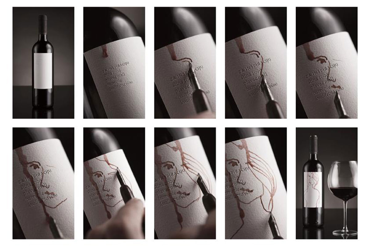
A perfect example is the labels of the Stina winery. The name of the winery itself means stone.
Stina wine originates from the island of Brač, renowned for its iconic white stone, a muse for artists through the ages. The wine labels, resembling a blank canvas, beckon individuals to unleash their creative expression. The very texture of the paper is alike a polished stone.
The inaugural single-vineyard offering from the winery, named Stipančić after the vineyard itself, is a product of the challenging terrain. The Stipančić vineyard, perched on a steep slope, is adorned with a four-layer label that mirrors its rugged contours. Hence, the creative challenge posed is to craft in harmony with the label’s slopes, akin to the dedication of the winemakers cultivating the Stina Plavac mali Stipančić vineyard.
Stina wine labels are internationally recognised by several design competitions as one of the best wine labels in Croatia.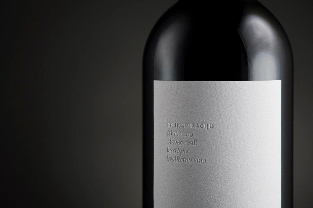
Frequently Asked Questions about Wine Label Designs
1. Do all wine labels follow the same design principles?
No, wine labels vary widely in design, ranging from classic and traditional to modern and conceptual. Each label is crafted to reflect the unique characteristics of the wine and the winery’s identity.
2. Why are QR codes becoming popular on wine labels?
QR codes are being used to comply with new EU regulations requiring detailed information about ingredients, allergens, and nutrition. Due to limited label space, QR codes provide a convenient way for consumers to access this information through special e-label web pages using smartphones.
3. Are vintage and residual sugars always mentioned on wine labels?
No, vintage and residual sugar information is not mandatory on all wine labels. Some wines, like Champagne, can be multi-vintage, and sweetness perception can be subjective based on acidity levels for example. These details might be omitted if they don’t provide essential information about the wine.
4. What are the essential elements of a wine label?
Every wine label should include information such as grape variety or appellation, region of origin, alcohol content, and details about the winemaker. These details empower consumers to make informed choices. When designing a wine label, many designers put the essential information on the back label.
5. How do graphic elements contribute to a compelling wine label design?
Visually striking graphics, whether illustrations, photographs, or abstract designs, grab consumers’ attention and convey the character of the wine. Graphics should resonate with the target audience and evoke emotions associated with the wine’s story.
6. Why is consistency important in wine label branding?
Consistency across product lines in terms of color palettes, fonts, and graphic elements creates a cohesive and recognisable brand identity. This helps consumers easily associate a label with a particular winery and builds brand loyalty.
7. What makes a wine label design successful?
A successful wine label design goes beyond ornamentation; it becomes a vessel for storytelling. It encapsulates the wine’s essence, the unique characteristics of the grapes, and the winery’s heritage in a way that resonates with consumers.